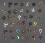
This is worse. Looking at these you can tell they have no significant monetary value. They were confiscated as a fear tactic. Nothing more.
This picture breaks my heart everytime it appears in my dash. It’s a fear tactic, alright but—
The first one in the left corner: It’s a first communion rosary, and it’s not cheap.
The black one in the first line: That’s a widow rosary and it’s old.
The white one in the second line: is a commemoration rosary. It has a miniature picture in the round part. I haven’t seen that since the 70′s.
In the third line, multicolor one: It’s an Anima mundi, I have only seen those in the hands of Rosary ministery’s old ladies. The oldest ones are from the 80′s after Juan Pablo II came to Mexico for the first time. It’s one of the old ones, I know because the crucifixes are different.
The third one on the fourth line: Red and gold. The style is old, the metal is dark, that’s a 50′s rosary, probably a quinceañera one (or it’s maybe older, from the 40′s when the brides carried red roses with their offerings).
The fifth one on the fourth line: It’s a quinceañera rosary with Ignatius’s tear. The style is old and in my part of Mexico is orphan girls who used it. At least it was when I was young.
The third one of the fifth line: the blue one with the anchor. That one I have only seen in Veracruz and it doesn’t look new.
The fifth one on the fifth line: That’s a 90′s wedding rosary. Black and white patterns were popular on that date.
The fourth one on the last line: That’s a first communion rosary from the 30′s. It’s delicate and most probably silver.
The rest wrench my heart too, the humble everyday rosaries with wooden beads and knots. Those are cheap and bear the wear and tear of their user handling. But those I described are much more.
Those are mother’s rosaries.
Those are not just rosaries. Those are mementos, that’s the proof of their families stories. They are taking from them the only portable things they can carry to feel the connection to their families.
I don’t work at Cartoon Network any more. But I’m going to give you a very quick portfolio review in hopes that you find it helpful!
Here are some things I noticed when looking at your stuff – lessons I learned from brilliant people while working on AT for two years:
1) AVOID SYMMETRY. Humans are organic, randomly shaped animals. Perfect symmetry rarely exists in nature and if it does, it’s conspicuous – it’s the exception rather than the rule. Find interesting ways to throw your characters off-balance.
Don’t repeat objects in twos – (buttons or rips or whatever) – it feels prescribed – cluster things in threes or fives if necessary.
2) AVOID CONCAVITY – I don’t know what else to call this. But it’s those lines that go “in” rather than “out”. You are using inward sloping lines to describe many of your characters. As an exercise, try using outward, rounded, voluminous lines to draw EVERYTHING. Humans are fleshy lumps connected together by other fleshy lumps. Each mass is either in front of or behind other masses and as a designer, it’s your job to tell the animator where it is. As a designer, you are providing a technical blueprint for the location of masses.
Only occasionally allow a concavity to connect two convexities. Look at the work of Robert Ryan Cory (spongebob), Tom Herpich (Adventure Time) or Phil Rynda (AT / Gravity Falls) – master character designers – for examples of this. If you need to, trace a couple of their drawings and you will see what I mean.
3) AVOID GRAPHIC DETAILS – Some shows use a graphic style; it’s very appealing and looks clever when done right. But in animation, everything needs to move in space – so if you use a graphic element – it needs to correspond with an actual 3D thing that can move. Therefore it is better to start with a voluminous style and then revert to graphic elements where appropriate. Art directors will look for this. Do not jump straight to graphic representation if you do not yet know what you are representing.
Look at the work of Tiffany Ford and Jasmin Lai for amazing examples of volume expressed graphically.
4) STUDY JAMES MCMULLEN – To truly understand volume, and fully respect your subject, you should read very carefully High Focus Figure Drawing by James McMullen. Slow down and think about drawing “around” your subjects. It’s a truly meditative experience when you get there. Think about the weight and mass that your characters, props and effects are experiencing. Many students from SVA – Tomer Hanuka, Becky Cloonan, Rebecca Sugar, James Jean – studied under McMullen’s philosophy and you can see this common richness in their work.
Jeffrey Smith, a top student of McMullen’s now teaches life drawing at Art Center. These are two of the best illustration schools in North America – anyone who is interested in drawing living things, should probably read his book.
Also look at the work of Andy Ristaino or Danny Hynes – two other character designers’ whose work is seething with volume.
I hope this is useful and I hope you have a wonderful career.
linguini from ratatouille is the most accurate representation of a broke millennial, like he has no idea what he wants to do with his life and has a shitty apartment and gets drunk and has intense anxiety and actually acknowledges how weird his situation is. like, he just found this rat that can cook and can somehow communicate and control his actions by pulling on his hair and that’s weird af, but fuck it he really needs this job so fine let the rat cook, he doesn’t even care how weird his life is anymore he just needs money.